Problem
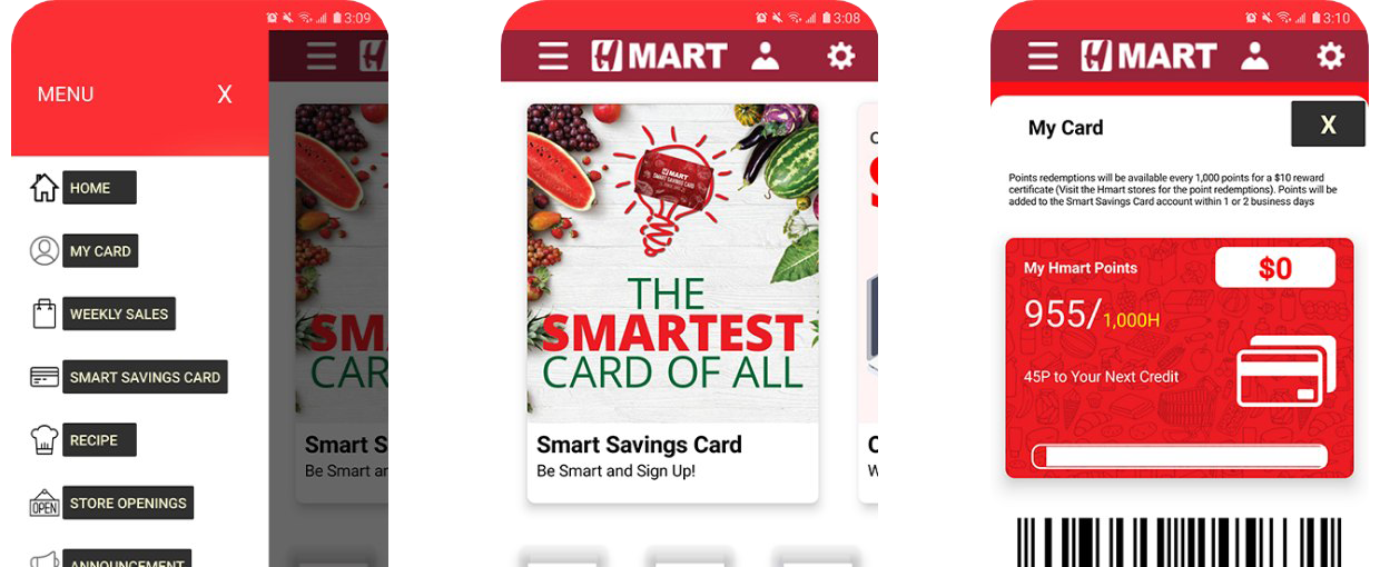
Most people are looking for an enjoyable and secure experience from a shopping app. Research shows that the more enjoyable and secure the experience feels, the more likely a person is to take action, to buy something and to trust the brand. The existing H Mart app fell short on both counts, with a dated interface and a structure that didn't reflect how people actually shop.
Solution
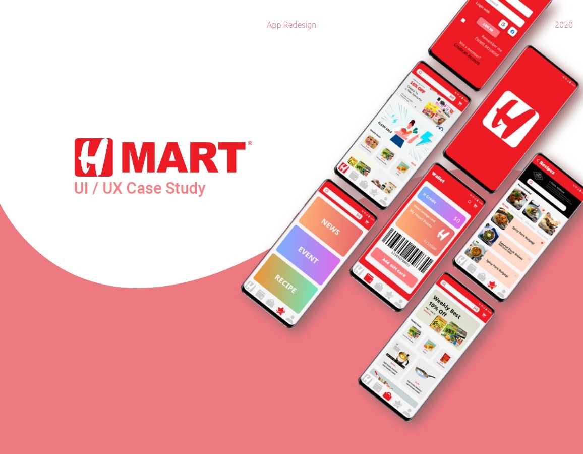
I designed a new app icon, a friendlier user interface, and a human-centered structure that is more personalized and secure for the people who use the app.
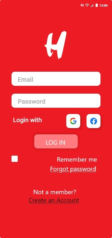
Sign up & sign in, register, secure personal information, shop freely
Customers can sign in or sign up using their email address and password. Registering creates a secure account so shoppers can move through the app, and their shopping list, with confidence.
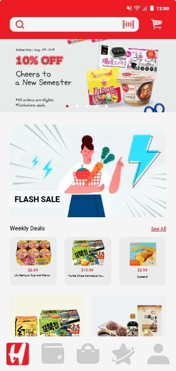
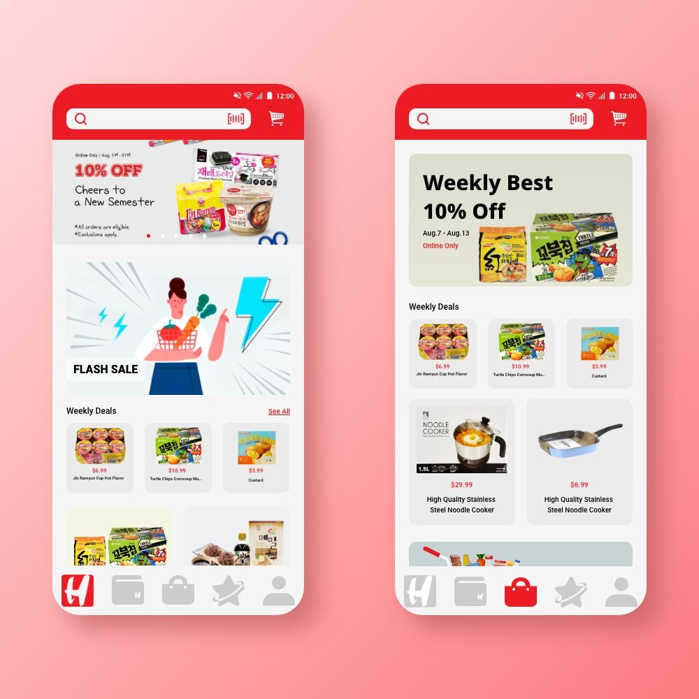
Search what you want with ease
People can see everything they need in a single page. Users can explore without digesting too much unnecessary information, research shows most people didn't mind scrolling when the content flow feels natural.
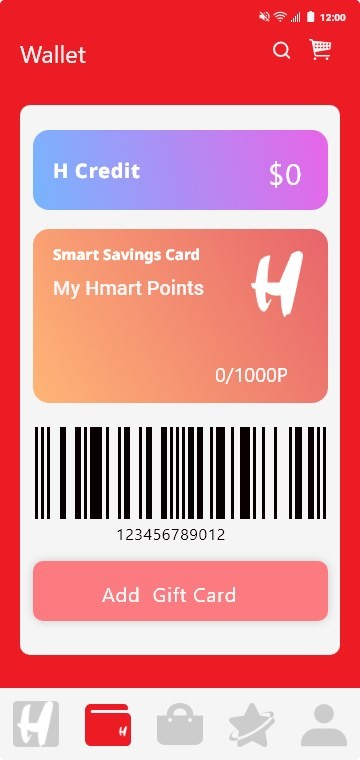
Smart card in a smart wallet
I focused on making the wallet page easy to read and use: the H Mart card and credit sit in one place, balances are visible at a glance, and adding a gift card takes one tap.
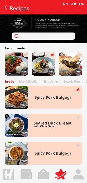
Treat yourself with simple recipes
People visiting Asian supermarkets often don't know many of the ingredients. The recipes section connects dishes to the exact ingredients they need, inspiration and shopping list in one place.
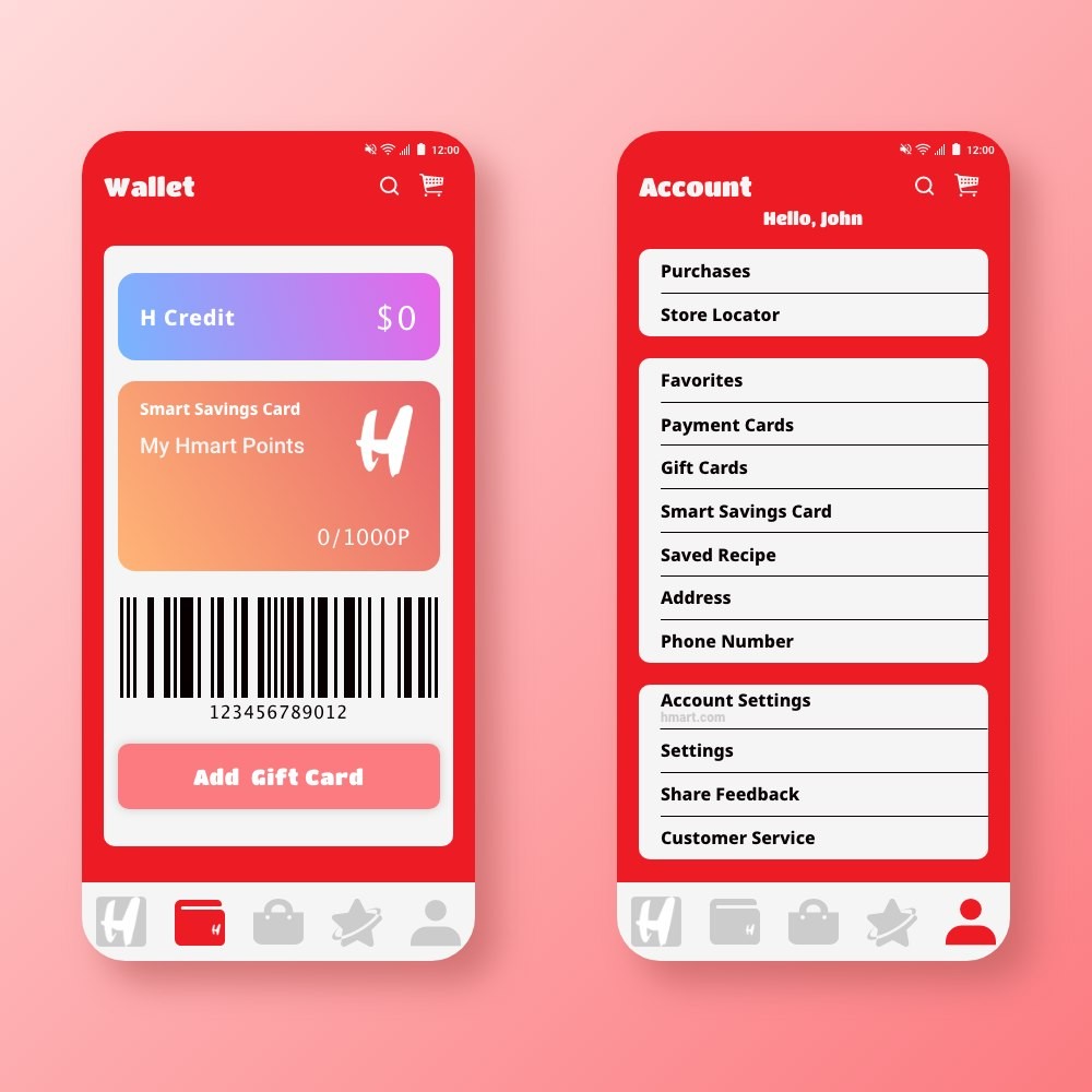
Take care of your personal information
Easy access to account information in one spot, purchases, store location, payment options, and personal details, organized so nothing takes hunting.
Outcome
The redesign gives H Mart a friendlier, more personal app: a secure account to shop with confidence, a single-page search, a wallet that's easy to read, recipes tied to real ingredients, and account details all in one place, the enjoyable, trustworthy experience that makes shoppers act.
What I Learned
Considerations for redesign
H Mart is one of the largest Asian grocery store franchises in the US, and its app serves an audience with diverse needs and expectations. Studying competitors showed that real business is very competitive, people still care about things like weekly ads, and a redesign has to respect what users already rely on while improving the overall experience.
Fundamental design principles
"Less is more" kept reminding itself while working on this project: it is easy to add features, and much harder to keep an experience simple. I kept returning to fundamental design principles, hierarchy, consistency, and clarity, to make sure every addition earned its place.