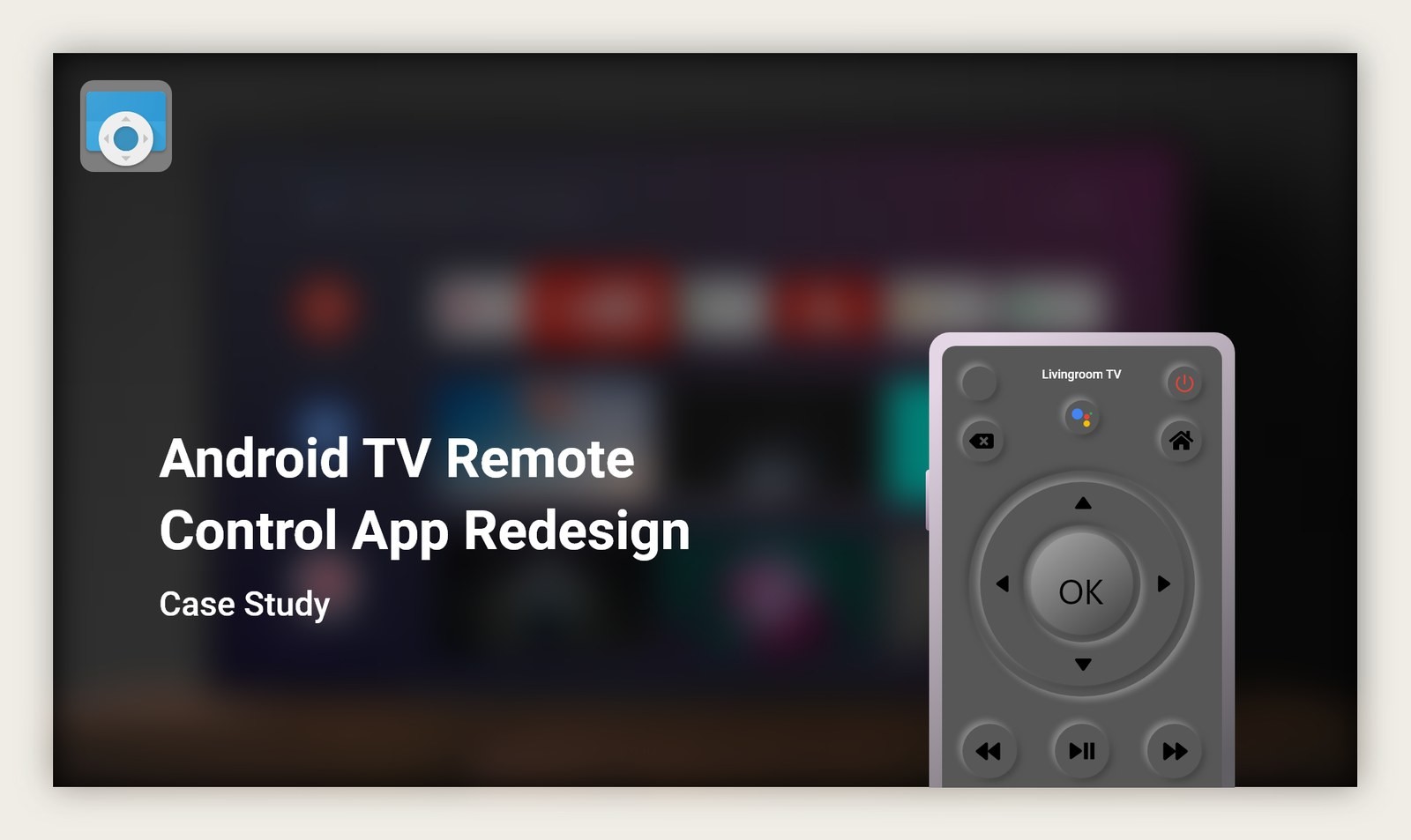
Problem
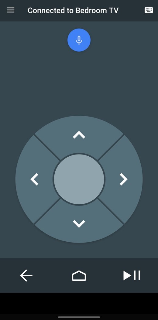
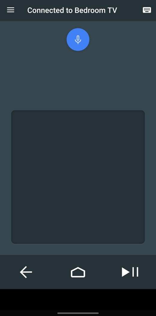
The official app is minimal to a fault. Simple isn't always better for users, this design caused real confusion about what users can and can't do.
- No power button, turning the device on and off was needlessly difficult
- Rewind, fast-forward, and volume controls were not clearly indicated
- The stripped-down interface hid capabilities users expected to find
Solution
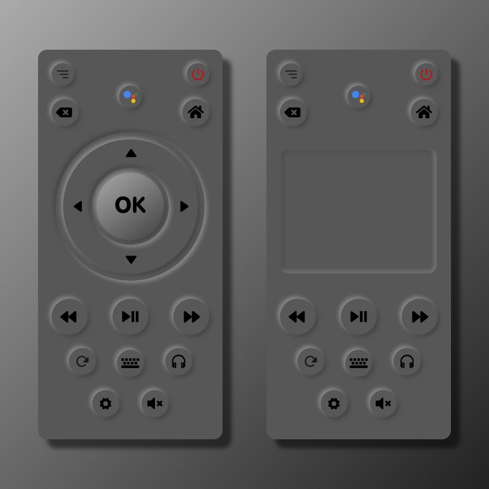
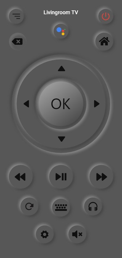
Add clearly labeled buttons and quick, intuitive functionality, by making the app behave like the physical remote users already understand.
- Power button added, the most basic expectation, finally met
- Physical volume buttons, the phone's side buttons control volume
- Mimics a physical remote, the interface layout mirrors the real thing for instant familiarity
- More quick navigation buttons, fewer steps to the things people do most
- Instant mute, one tap, integrated where thumbs expect it
Colors & Typography
A dark, living-room-friendly palette, #101010, #575757, #969696, #505050, #EA4236, #FFFFFF, with Roboto for interface text and VAG Rounded for display. High contrast keeps controls legible from the couch, and the single red accent marks the most important actions.
All Screens
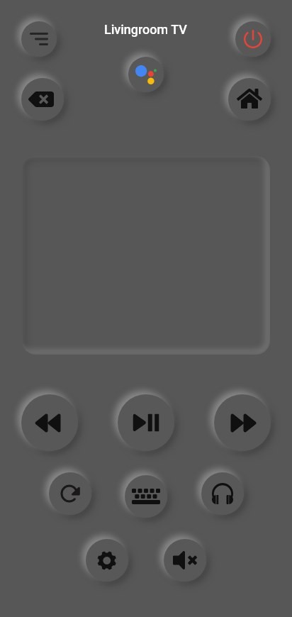
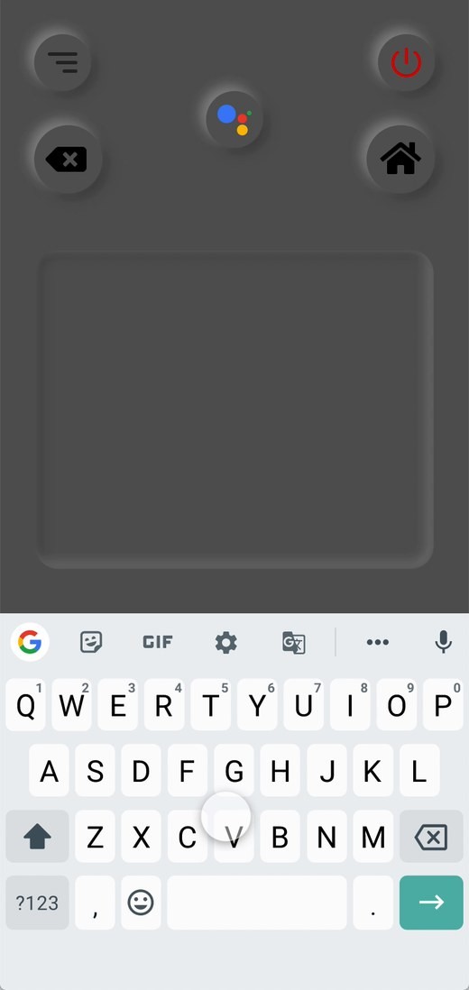
The final design covers three modes, D-pad, touchpad, and number pad, so users can control their TV the way they prefer.
Outcome
Every control users expected from a physical remote is now present and labeled: a power button, real volume buttons, quick navigation, and one-tap mute. The app finally matches the intuition people already have, so there's almost nothing new to learn.
Prototype in Motion
A walkthrough of the interactive prototype, mode switching, media controls, and instant mute.