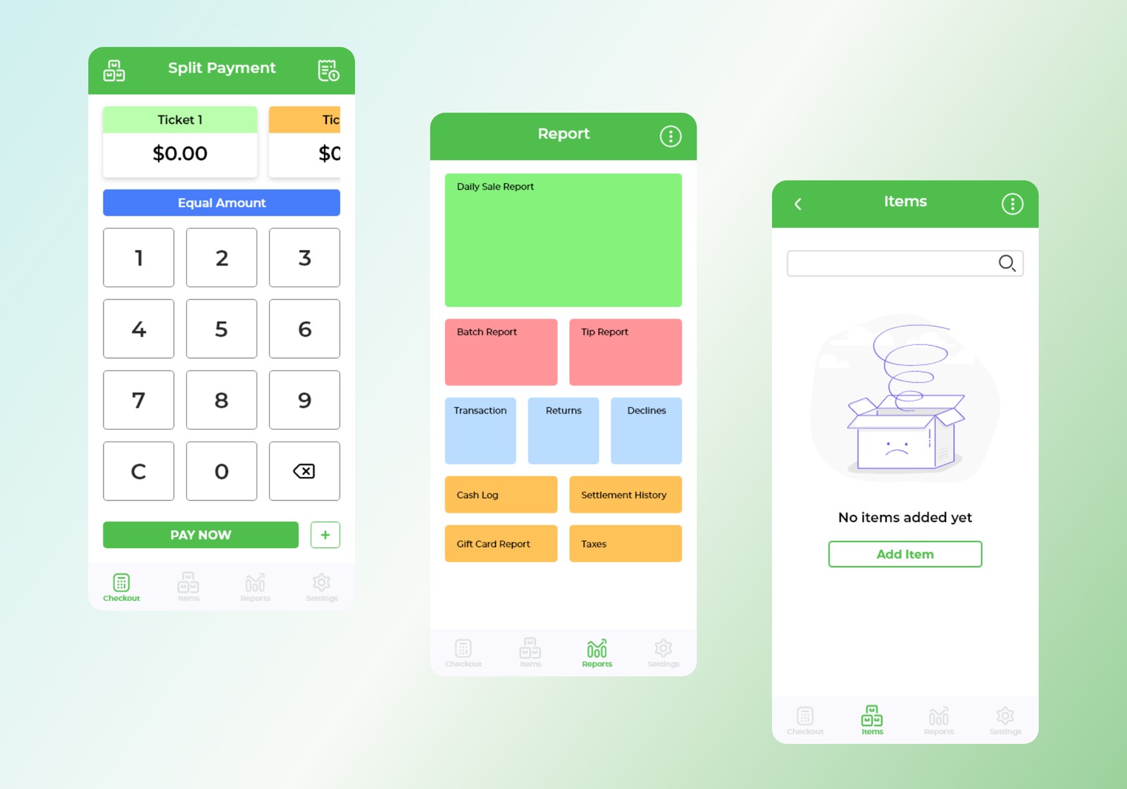
Problem
The POS platform lacked a clear visual system and consistent interaction patterns, leading to confusion for both users and internal teams. Business owners and employees struggled to learn and navigate the system due to inconsistent layouts and unclear onboarding. At the same time, the absence of design standards caused misalignment between stakeholders and developers, slowing down iteration.
Before Experience
- Inconsistent UI patterns across screens
- Unclear onboarding flow with little guidance
- Lack of visual hierarchy, making navigation difficult
- No shared design standards, leading to inconsistent implementation
As a result, users needed more time to understand the system, and teams spent additional effort clarifying and reworking designs.
Goals
- Create a consistent and intuitive user interface
- Improve onboarding and usability for business owners and employees
- Establish clear design standards to align stakeholders and developers
Approach
To understand user expectations and industry standards, I analyzed leading POS systems like Clover and Square, focusing on onboarding, payment flows, and inventory management.
Key insights
- Simple onboarding improves adoption and reduces drop-off
- Consistent UI patterns reduce learning time
- Clear navigation and shortcuts improve daily efficiency
Key trade-offs
- Speed vs. foundation, built a design system first for long-term consistency, rather than quick UI fixes
- Flexibility vs. consistency, standardized core components while allowing flexibility across POS features
- Business needs vs. usability, balanced feature requirements with simplicity for first-time users
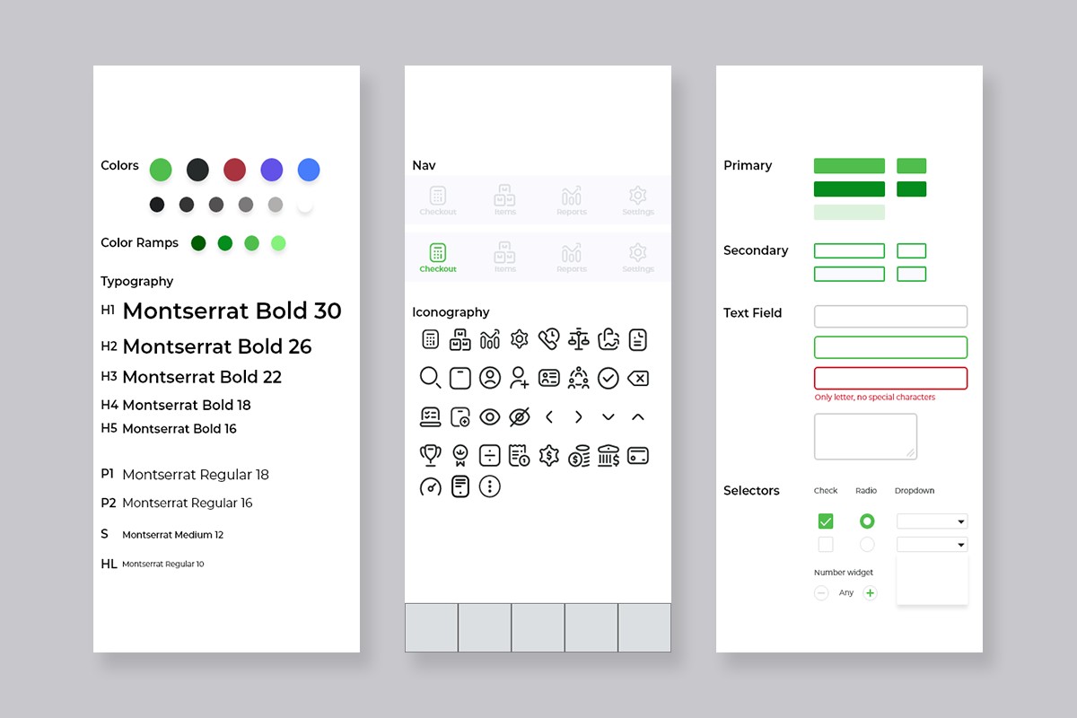
Solution
I designed a scalable design system and restructured key user flows, focusing on onboarding and core navigation.
Key design decisions
- Design system foundation, typography, color, spacing, and reusable components for a consistent visual language
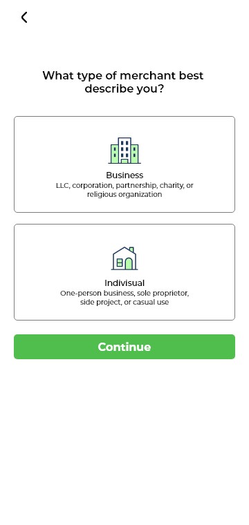
- Structured onboarding flow, clear, step-by-step guidance that introduces the system gradually
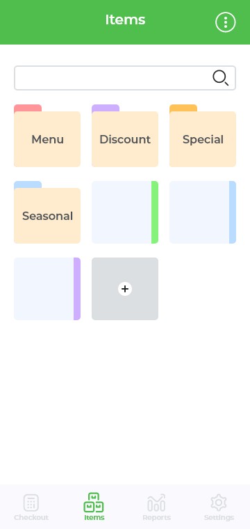
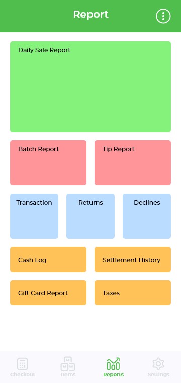
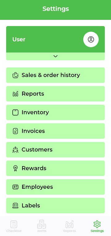
- Improved navigation and hierarchy, dashboards and menus organized so key actions are visible and accessible
- Reusable components, standardized buttons, forms, and UI patterns to reduce variation
- Interactive prototypes, high-fidelity prototypes to communicate design intent and reduce ambiguity



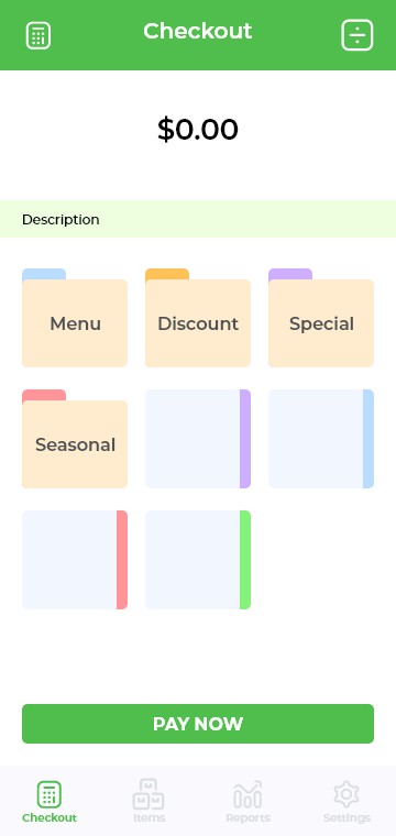
Designed for everyday use
Clear hierarchy and consistent patterns make frequent tasks, sales, inventory, reporting, fast and predictable.
Experience Improvement
Before
- Inconsistent UI and interaction patterns
- Unclear onboarding with little guidance
- Difficult navigation and learning curve
- Frequent misalignment during implementation
After
- Consistent visual system across all screens
- Step-by-step onboarding for easier adoption
- Clear navigation and improved hierarchy
- Predictable and reusable UI patterns
Results & Learnings
The design system created a shared language for stakeholders and developers, reducing ambiguity, improving communication, and making implementation more consistent across features. Onboarding plays a critical role in product adoption: clear, guided experiences significantly reduce friction for new users.
- Strong design systems enable scalability and consistency
- Competitor analysis helps identify proven UX patterns
- Clear structure and documentation improve team efficiency
- Guided onboarding improves user confidence and adoption