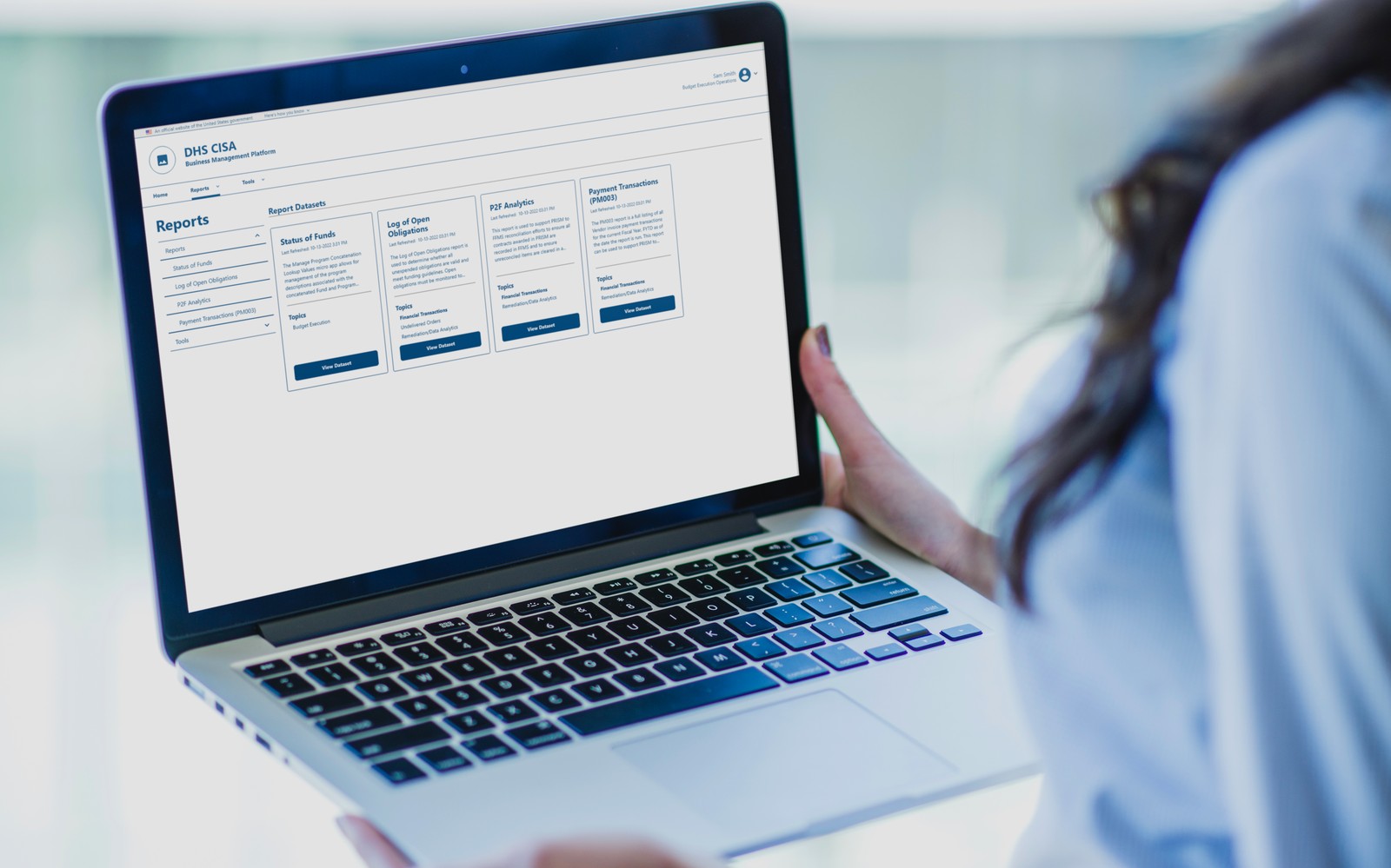
Problem
The BMP platform lacked a cohesive visual language and clear interaction patterns, which led to confusion for users and inefficiencies for the development team. Financial officers struggled to navigate the platform due to inconsistent layouts and unclear hierarchy. At the same time, developers had no standardized components, making implementation slower and inconsistent across features.
The platform also had accessibility issues, creating barriers for some users and potential compliance risks.
Before Experience
- Inconsistent typography, spacing, and component styles across screens
- Unclear visual hierarchy, making it hard to scan and prioritize information
- Different interaction patterns for similar actions (e.g., buttons, forms)
- Accessibility gaps such as low contrast, missing labels, and weak focus states
These issues increased cognitive load for users and created inefficiencies for developers, who had to recreate patterns without clear standards.
Goals
- Create a consistent visual language across the platform
- Align the platform with the U.S. Web Design System (USWDS)
- Ensure accessibility compliance and inclusive usability
Approach
What we found
I started by auditing the existing platform to identify usability and accessibility issues, reviewing typography, spacing, layout patterns, and component behavior across multiple screens. Accessibility testing revealed gaps in contrast, labeling, and keyboard navigation. These findings showed the problem was not isolated to individual screens, but systemic.
The decision
The platform needed to be rebuilt on a solid foundation. Rather than inventing one, we used the federal government's existing design system, USWDS.
My role: the redesign was my scope, I led it end to end, while the team helped align decisions with USWDS and the goals of the project.
Key trade-offs
- Consistency vs. flexibility, standardized core components while supporting complex financial workflows
- Speed vs. scalability, built reusable components that scale, rather than quick one-off fixes
- Accessibility vs. legacy constraints, prioritized the most critical usability issues within the existing system's limits
Constraints
- Existing platform structure and legacy UI patterns
- Need to support complex financial workflows
- Alignment with accessibility standards and compliance requirements
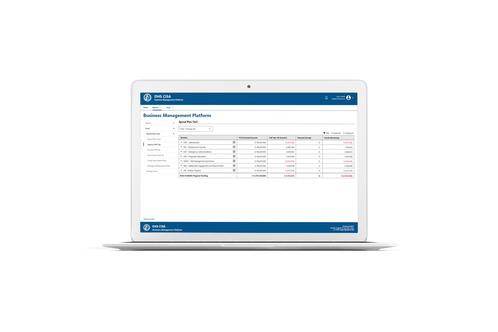
Solution
Based on the audit and accessibility findings, I redesigned key screens, aligning the platform to USWDS and extending its patterns where complex financial workflows required it.
Key design decisions
- Standardized visual system, consistent typography, spacing, and layout rules for clear hierarchy
- USWDS component alignment, mapped the platform's buttons, forms, inputs, and tables to USWDS components, adding new patterns where financial workflows needed elements the system didn't cover
- Improved interaction patterns, aligned similar actions to behave consistently, reducing confusion and learning time
- Accessibility improvements, enhanced contrast, labeling, and focus states to meet standards
- Interactive prototypes, Figma prototypes to validate decisions and guide developers
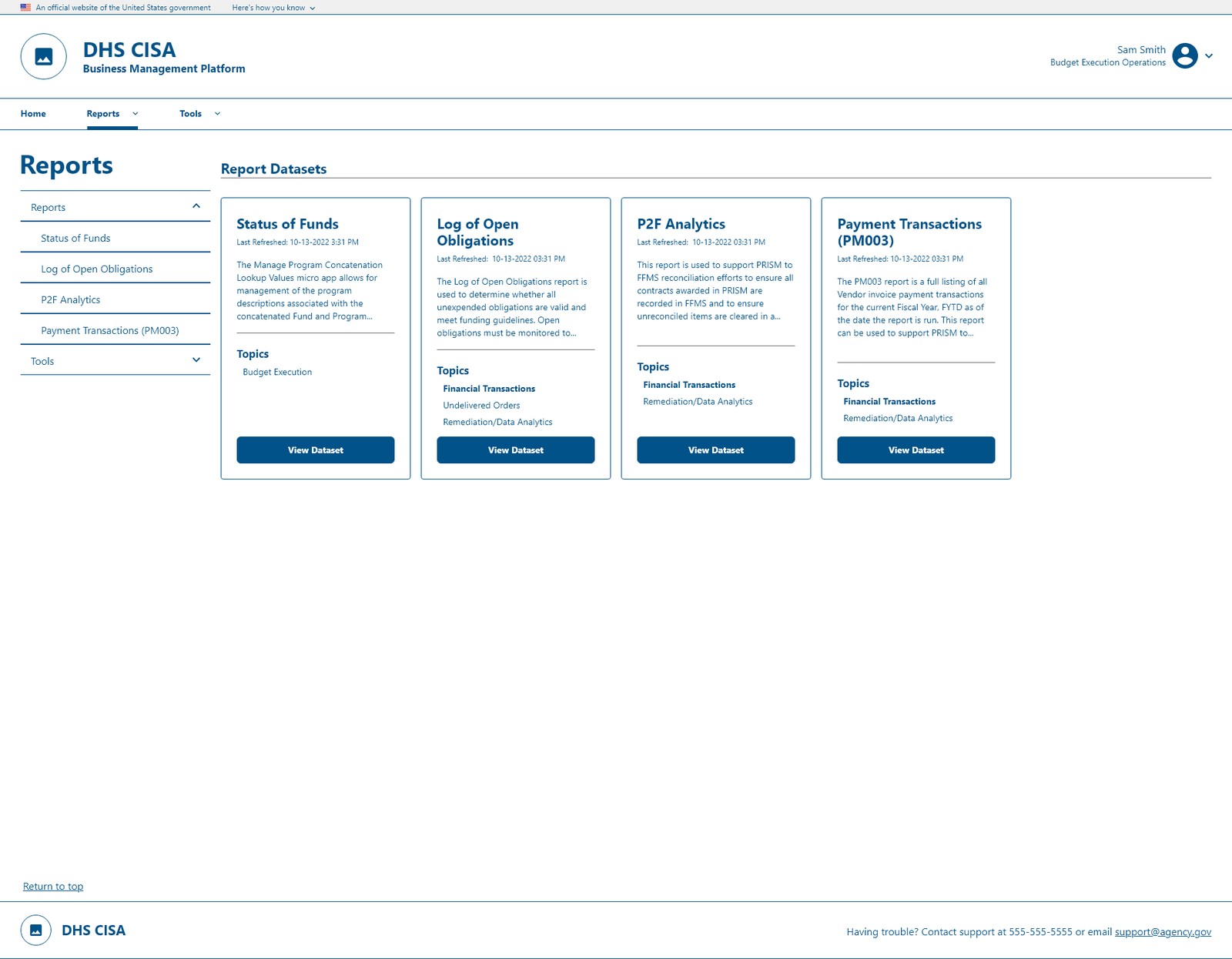
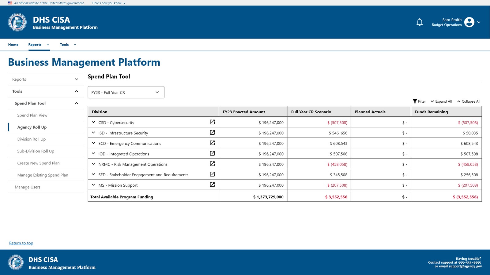
The Spend Plan Tool shows the same system doing heavier lifting: consistent navigation cards for every roll-up, and dense budget tables that stay scannable with clear status coloring.
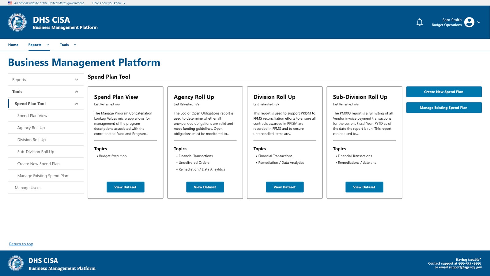
Experience Improvement
Before
- Inconsistent UI across screens
- Unclear hierarchy and difficult navigation
- Repeated patterns implemented differently
- Accessibility issues affecting usability
After
- Unified visual language across the platform
- Clear hierarchy for easier scanning and decisions
- Consistent interaction patterns
- Improved accessibility and usability
Results
- Improved task clarity and navigation for users
- Reduced confusion caused by inconsistent UI patterns
- Increased usability through accessibility improvements
- Faster and more consistent implementation by developers
Impact
- Addressed accessibility issues, ensuring compliance with standards (contrast, focus indicators, labeling)
- Streamlined developer handoff through detailed prototypes and USWDS-aligned specs
- Left a USWDS-aligned foundation that keeps future features consistent
- Enhanced the experience for a wider, more inclusive audience
Learnings
Accessibility improvements often lead to better usability for all users. Working within an established design system like USWDS speeds teams up, the real skill is knowing how to apply it faithfully and when to extend it. System-level problems require system-level solutions: fixing individual screens is not enough without a strong foundation.