Problem
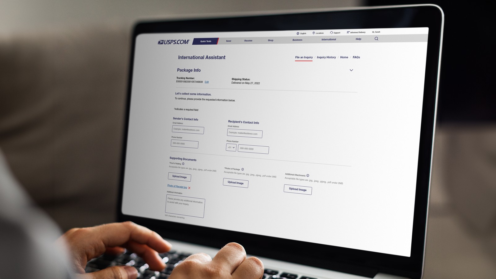
USPS handled over half a million international inquiries and claims annually, yet two-thirds were still managed by Customer Care agents despite an existing online form. As a result, operational costs remained high, and customers experienced a frustrating support process that often required phone assistance.
Before Experience
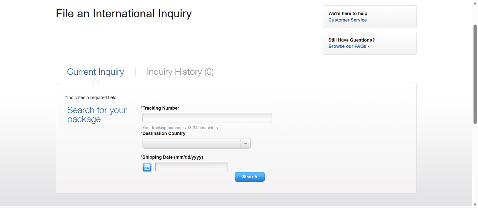
The existing online inquiry form was a static, multi-step process that required users to complete everything on their own without guidance.
- Users had to interpret requirements without clear instructions
- High cognitive load due to too many fields shown at once
- No clear step-by-step progression
- No save functionality, forcing users to restart if interrupted
As a result, users frequently made errors or abandoned the process and contacted Customer Care instead.
Goals
- Create a clear, conversational user experience
- Decrease Customer Care Center calls
- Increase self-service use for international inquiries
- Make the process simpler
Approach
What we found
We initially explored improving the existing form with minor updates. However, usability findings showed that the core issue was structural, not visual, users struggled with understanding what information was needed, and when.
The decision
This led us to move from incremental improvements to a full redesign focused on guided interaction.
Key trade-offs
- Redesign approach, chose a full structural redesign to address confusion and drop-off, instead of surface-level improvements
- Experience vs. constraints, designed a conversational, step-by-step flow while working within existing USPS system limitations
- Content strategy, simplified instructions and reduced steps without losing required information
Navigating constraints
- Worked within existing USPS backend systems
- Followed USPS design standards and accessibility requirements
- Balanced simplicity with operational and regulatory needs
Solution
I led UX design across 10 sprints using a human-centered design process, working closely with stakeholders to align user needs with system capabilities. The redesign focused on reducing uncertainty and guiding users through each step.
Key design decisions
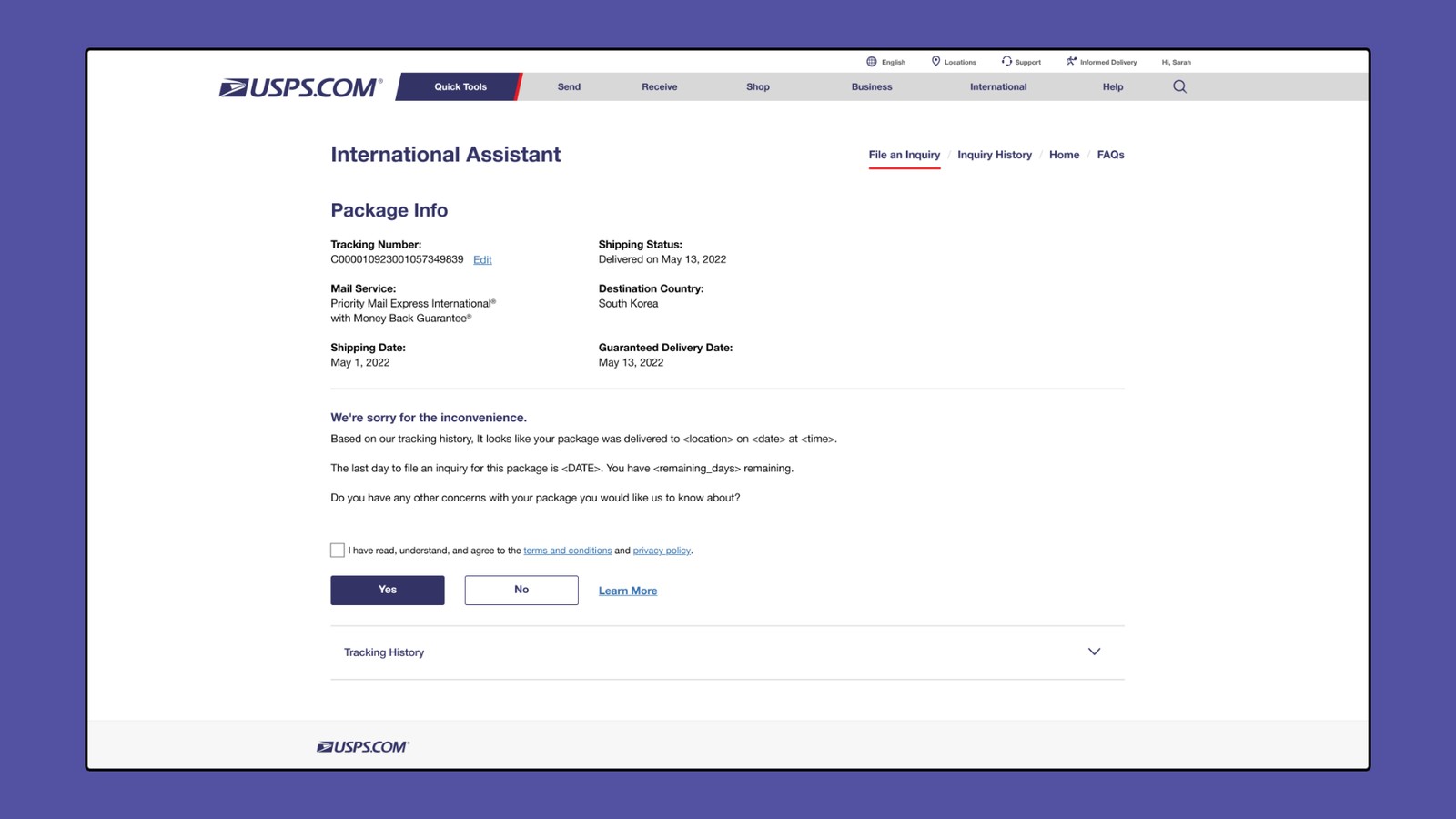
- Guided conversational flow, replaced a long static form with a step-by-step experience to reduce cognitive load
- Auto-filled shipment data, pre-populated known information to reduce manual input and errors
- Progressive disclosure, displayed only relevant fields based on user input
- Save and resume, let users pause and return later, reducing abandonment
- Accessible, consistent UI, designed to USPS standards with accessibility in mind
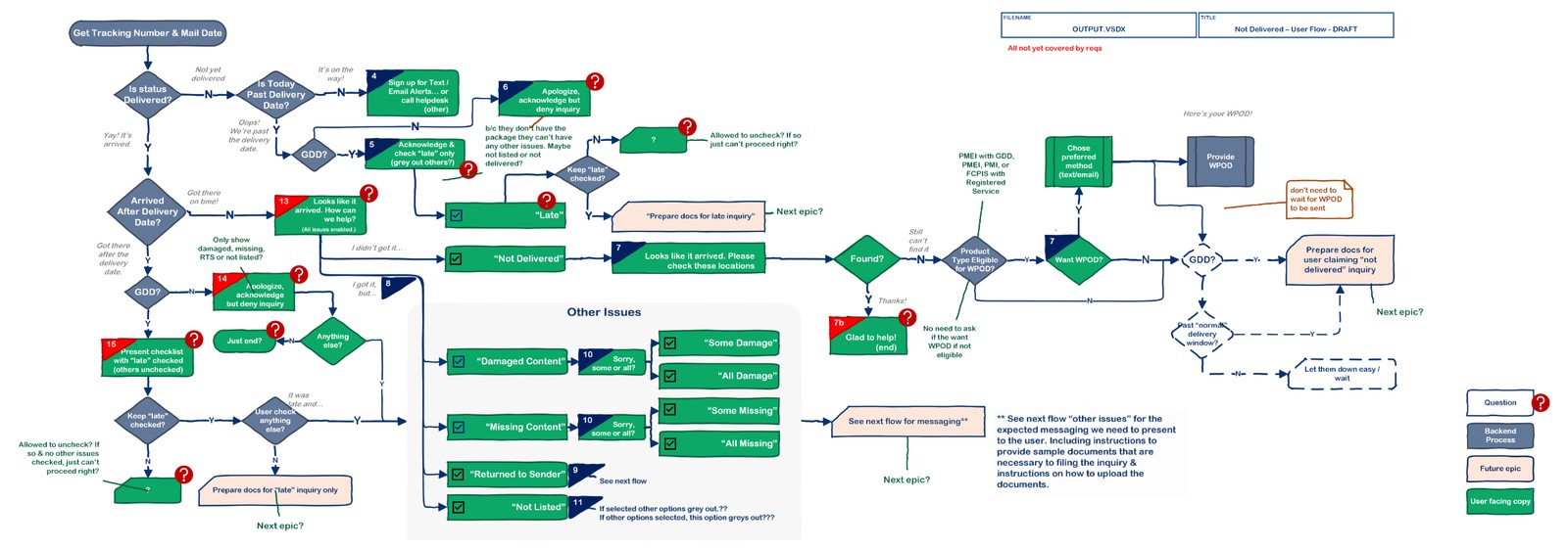
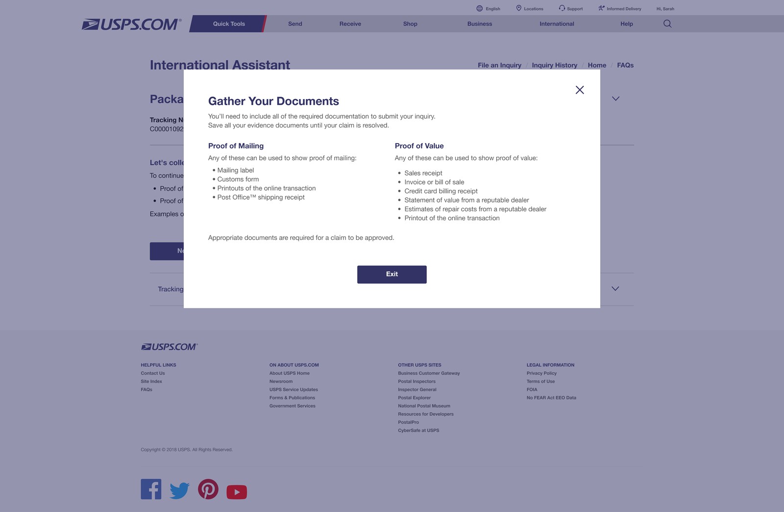
Progressive disclosure means users only ever see the questions and documents relevant to their specific inquiry, nothing more.
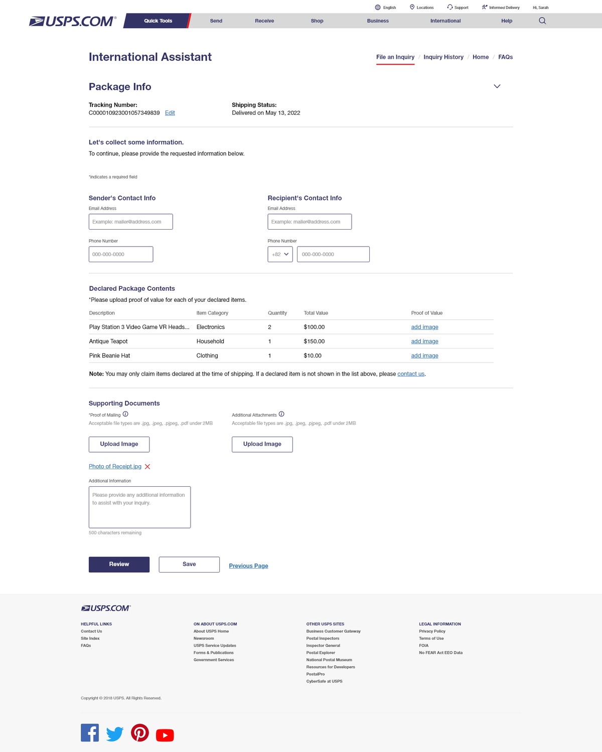
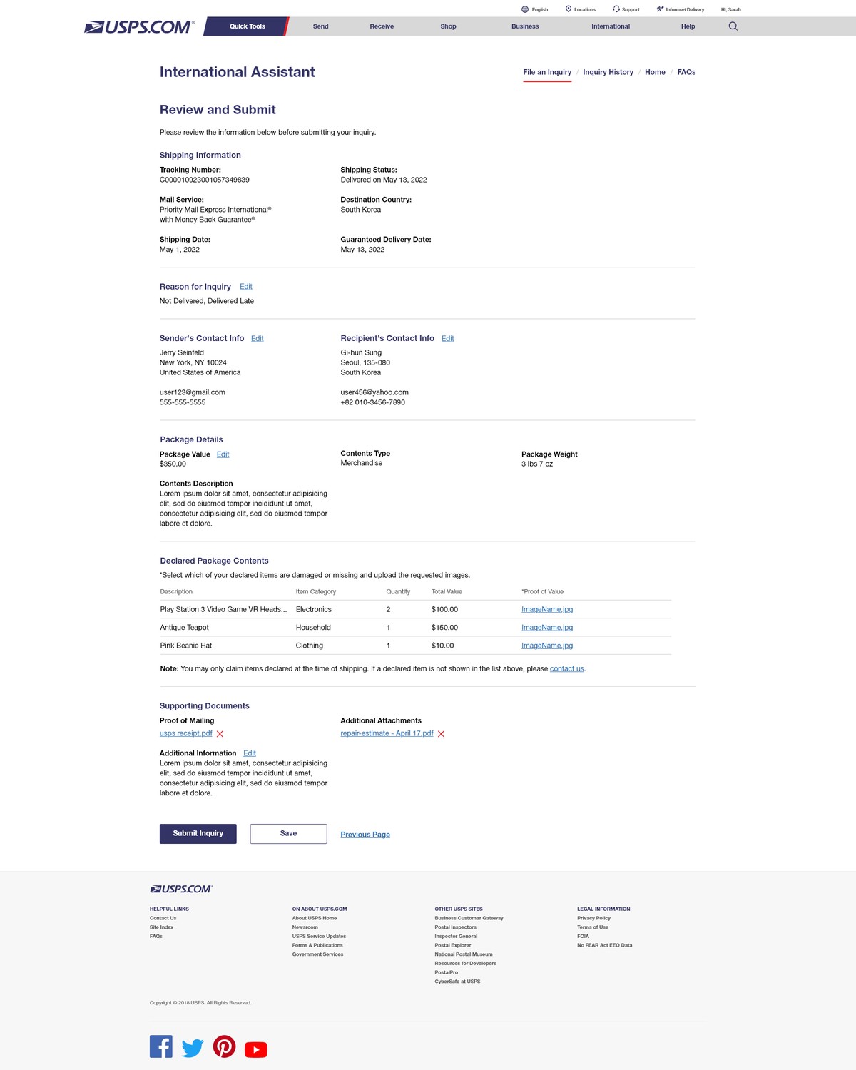
Known shipment data is auto-filled, and every path ends the same way: a plain-language review before anything is submitted.
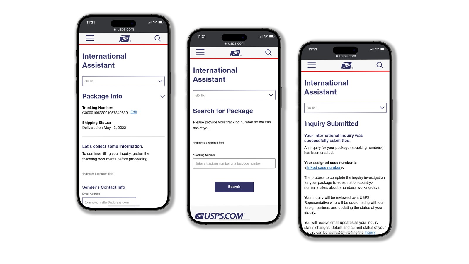
Designed for mobile
The guided flow was designed responsively, so customers can file and track an inquiry entirely from their phone.
Experience Improvement
Before
- Static form with little guidance
- Users responsible for figuring out requirements
- High chance of errors and abandonment
- No flexibility to pause or resume
After
- Step-by-step guided experience
- Clear instructions at each stage
- Reduced errors through structured input
- Save-and-resume for flexibility
Results
- Increased task completion rates during usability testing
- Reduced user errors through guided input and automation
- Improved user confidence throughout the process
- Decreased dependency on Customer Care for support
Impact
- Estimated $800K annual savings from reduced call volume
- Increased self-service adoption and faster completion times
- Consistent, accessible experience aligned with USPS standards
Learnings
Clear, step-by-step guidance and simple language significantly improve completion rates. Designing with accessibility and system constraints in mind early helps reduce rework later. Breaking complex processes into smaller, guided steps creates a more usable and scalable experience.