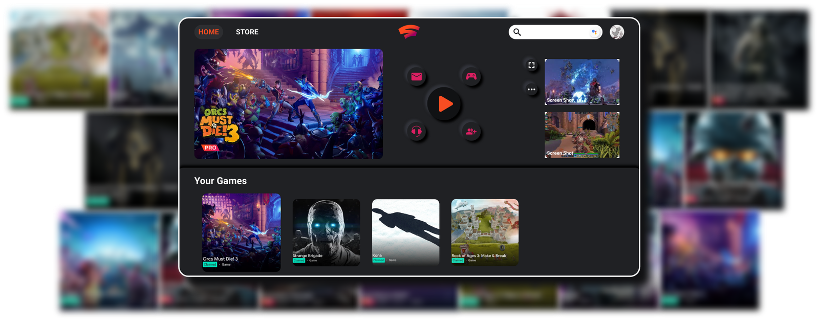
Problem
I used Stadia for months and researched how the community felt about it. Overall, people had positive experiences, but since Stadia was still new, there was plenty that could be improved, especially in how players find and manage their games.
1 · Cross-Platform Design
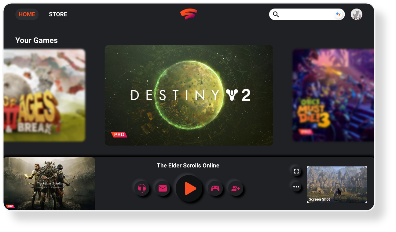
The previous design focused heavily on the games players were already playing, but the game library wasn't friendly: games sat in two columns, and anyone with a large library faced infinite scrolling to find a particular title.
QuickView
A quick view for the game library, horizontal scrolling shows a large list of games in one screen, so browsing scales with your collection.
One central place
Playing, messaging, chatting, and connecting a Stadia controller grouped into one central hub for easy gaming and socializing.

2 · Improved Store Page
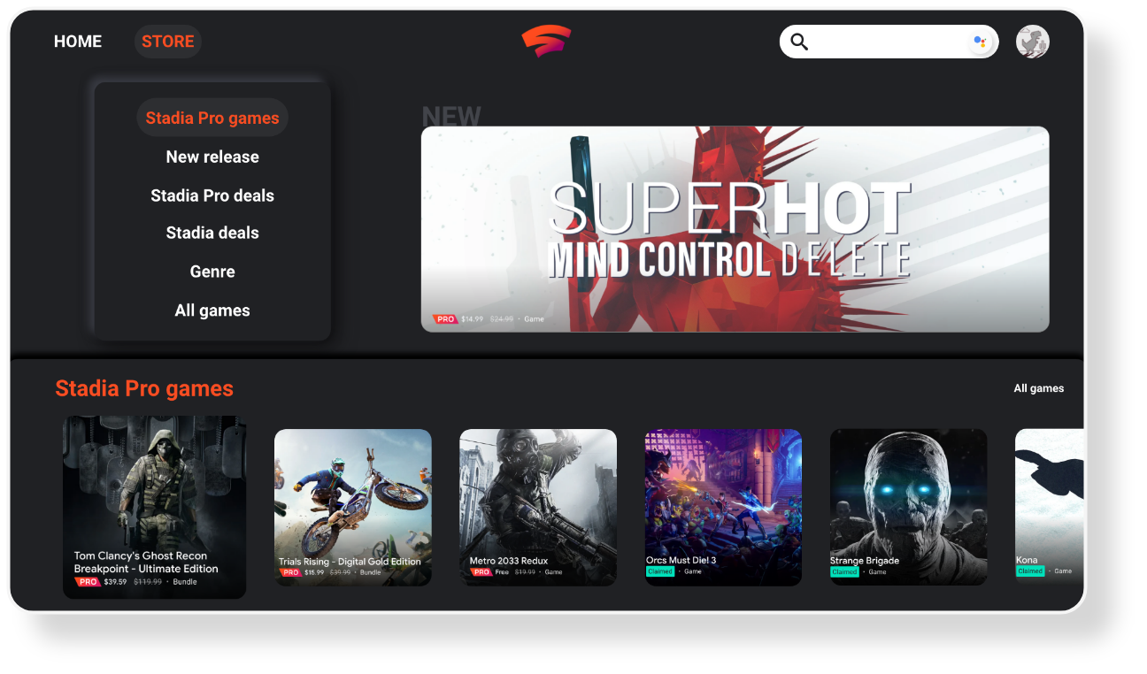
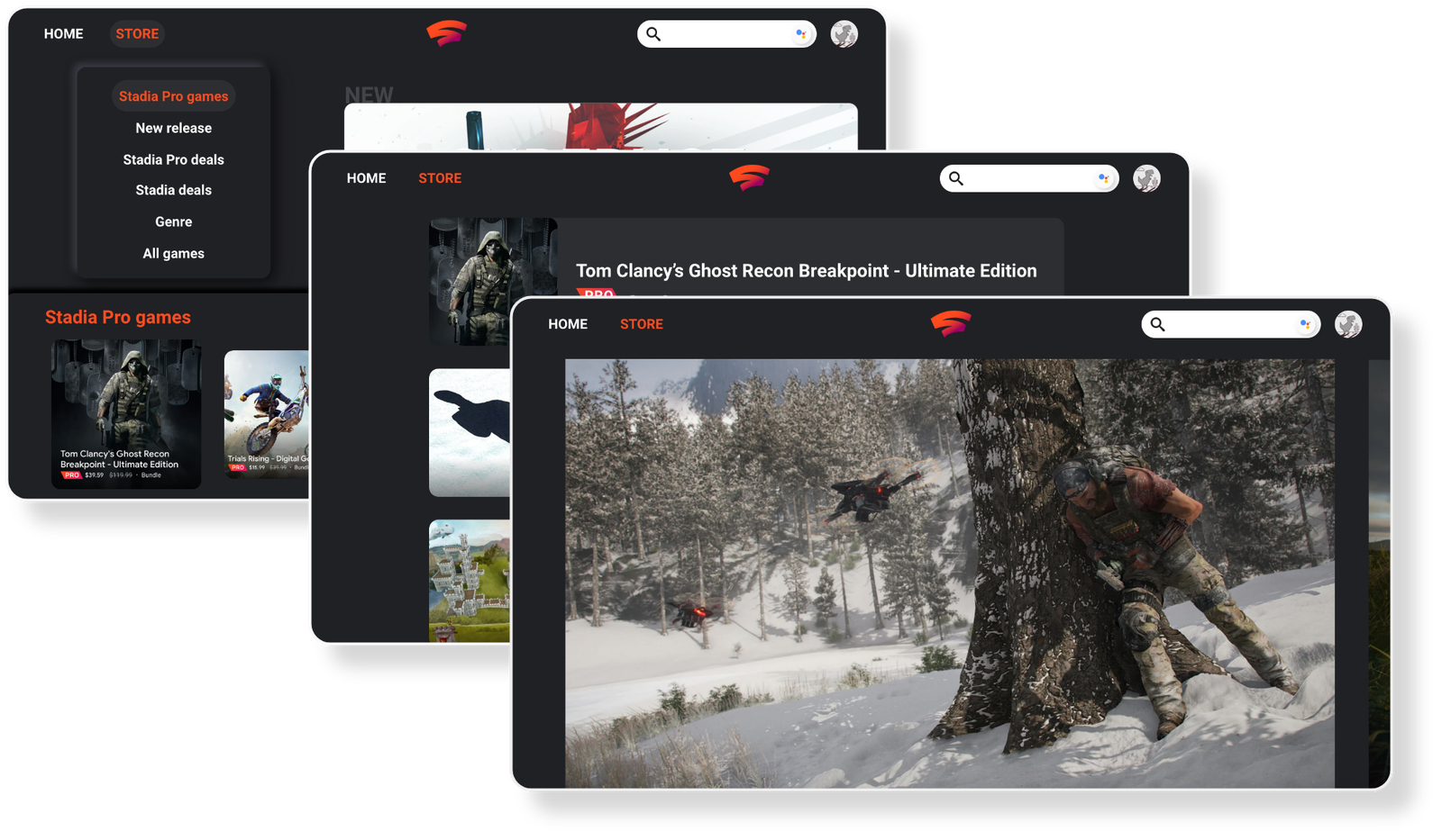
The previous store had no search option, and users were suffering for it. Games weren't categorized by genre, and there was no way to filter.
- Search, users want to find the game they want to play quickly, so a search bar was added in the top-right corner
- SubMenu, added for faster navigation, letting users browse games by genre
3 · Unified Pages
Sub-pages were rebuilt with consistency, a lot of work went into unifying layouts so every game page feels like part of the same product.
4 · Explored Iterations
As with any design project, there were always iterations that got pushed aside for various reasons. Exploring, and discarding, directions was part of finding the ones that worked.
Outcome
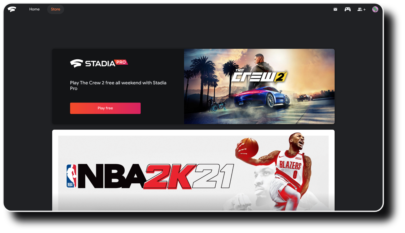
Together, these changes target where players told me the experience fell short: QuickView lets the library scale to any collection instead of endless scrolling, one central hub keeps playing and socializing in a single place, the store finally has real search and genre browsing, and every game page shares one consistent layout, so Stadia stays easy to navigate as a player's collection grows.